STEARS
Project Type: Mobile Design
Roles: Product Designer
Industry: Data Analytics
Providing subscription-based data and insights for mobile.
Overview
Stears is a data and intelligence company that leverages technology to provide subscription-based data and insights to global businesses and professionals. It aims to become the world’s most trusted provider of African insight and data.
Now a MaC Venture Capital and Serena Williams’ backed startup, Stears has an insights publication that is home to 1000+ stories crisply told with data, deep research and rigour across topics, themes and industries.
Background
I joined the Stears delivery team in July 2021 and functioned in the capacity of a designer, bringing visuals and product interfaces to life.
In the last quarter of 2021, the product team conferred and reached the decision to start building out features to make Stears a product that would be used by millions of users. The objective of scaling up the product to a global level was defined. The work done to achieve this goal is sectioned into two; the Stears mobile app and redesign of the Stears Election website.
The timeline for the Stears mobile app project was 6 months and the team that worked together to make it happen consisted of two product managers, two designers and a hybrid mobile app developer.
The Process
The year is 2022 and information is one of the best ways to know what is going on in the world.
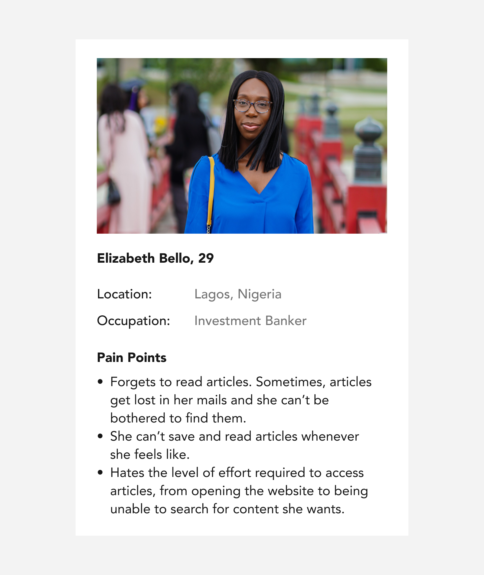
Meet our user Elizabeth; she is tech savvy, enjoys following news and getting information about happenings in Africa. She needs a publication that provides answers to her questions. How might we make Stears accessible to hundreds of thousands like her?
📈 Our goal is to scale the reach of users by maximising how they are able to access articles and data insights.
The product design process for this project follows a data backed approach and a design thinking centered Agile UX methodology which was necessary to eliminate unnecessary processes, maximise work efficiency and fast iteration.
Gathering Insights and Research
Having identified a possible problem our users were having, a validation was necessary for the need to design and build out a mobile app experience as an addition to the existing Stears website.
Leveraging on data gotten from Google Analytics of the Stears website, the existing audience was reviewed. Comparing users according to country and device types used, mobile devices were discovered to be the favoured device type. Figures from the data team indicated that there was an average of 4,000 monthly mobile users on the website compared to 2,450 desktop users in Nigeria (Stears Data).
This data shows that there were more mobile phone users than desktop. It is important for the users to access articles and data on the go.
I had earlier carried out a small scale survey during my recruitment with existing users, asking some survey questions.


Empathising
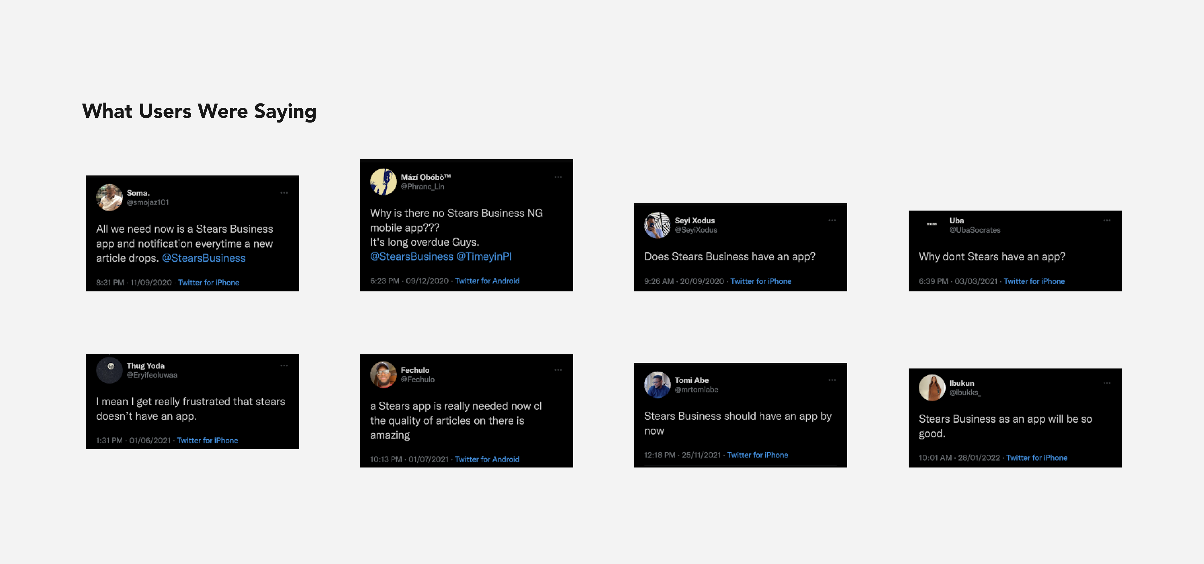
Stears has a strong social media presence as a publication. Additional insights were gotten from social media users' comments, calls and interviews. This qualitative research and interviews provided data directly from existing users.
One particular drawback was observed when Twitter was banned in Nigeria for about a month and some users were unable to get notified about new articles via our social media account.
The need for a mobile app can be justified in giving the best ROI with the feedback from users and how good it will be for business in the following regards;
- Better user experience
- App store presence
- Owning one’s product channel
- Increase in reliance on mobile devices to access services

Research Findings
The findings from research and empathising helped to identify the target users and their pain points. The exact users and their needs could then be defined. Product designer, Victor Enesi shared more insights about the research findings.
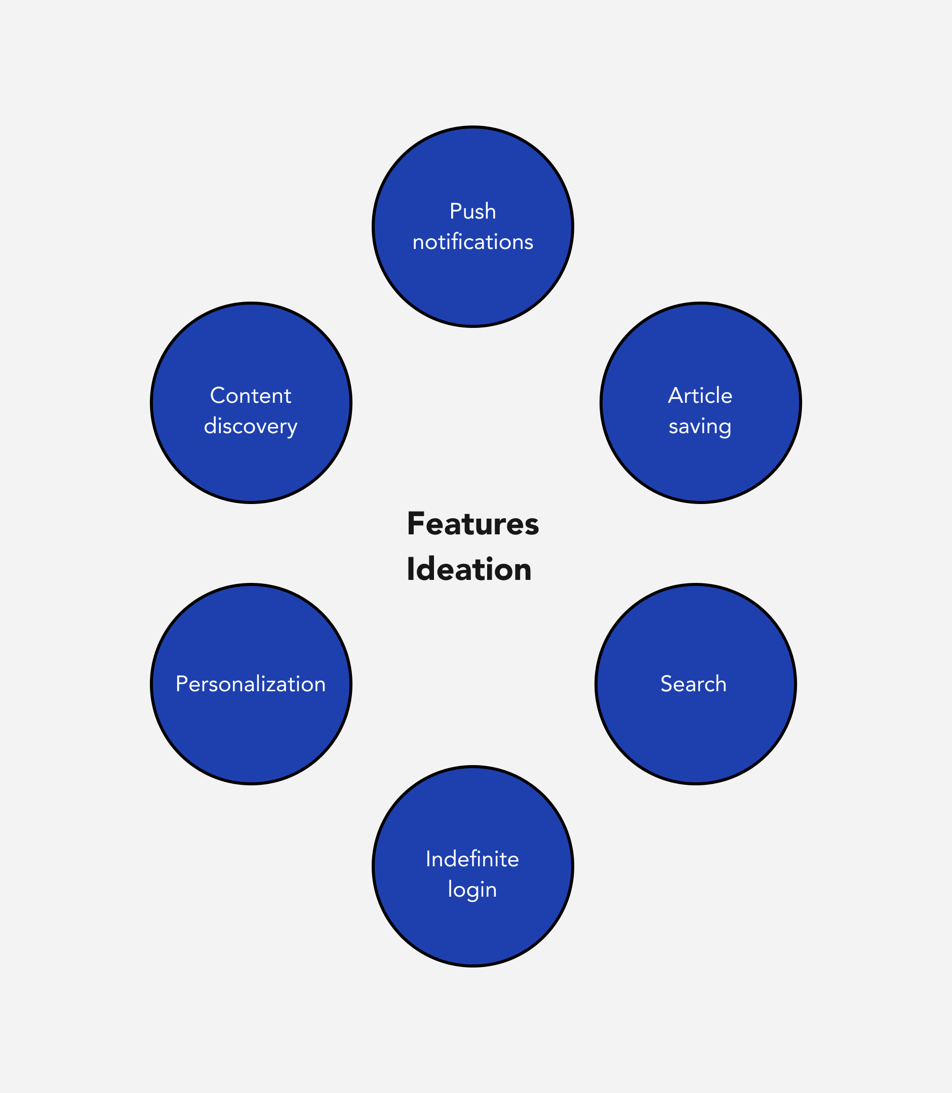
Ideations
Having people come together to collaborate is one of the best parts of the product design process. Ideation sessions were scheduled for a collaborative effort to come up with ideas that will be functional for identified users pain points. Project managers, designers, developer and content analysts were involved in this process. The product main features were collated and prioritised according to the project and development timeline.
One important feature recommendation I made was highlighting text, following the Medium platform approach that allows users to note key parts of articles they are reading.
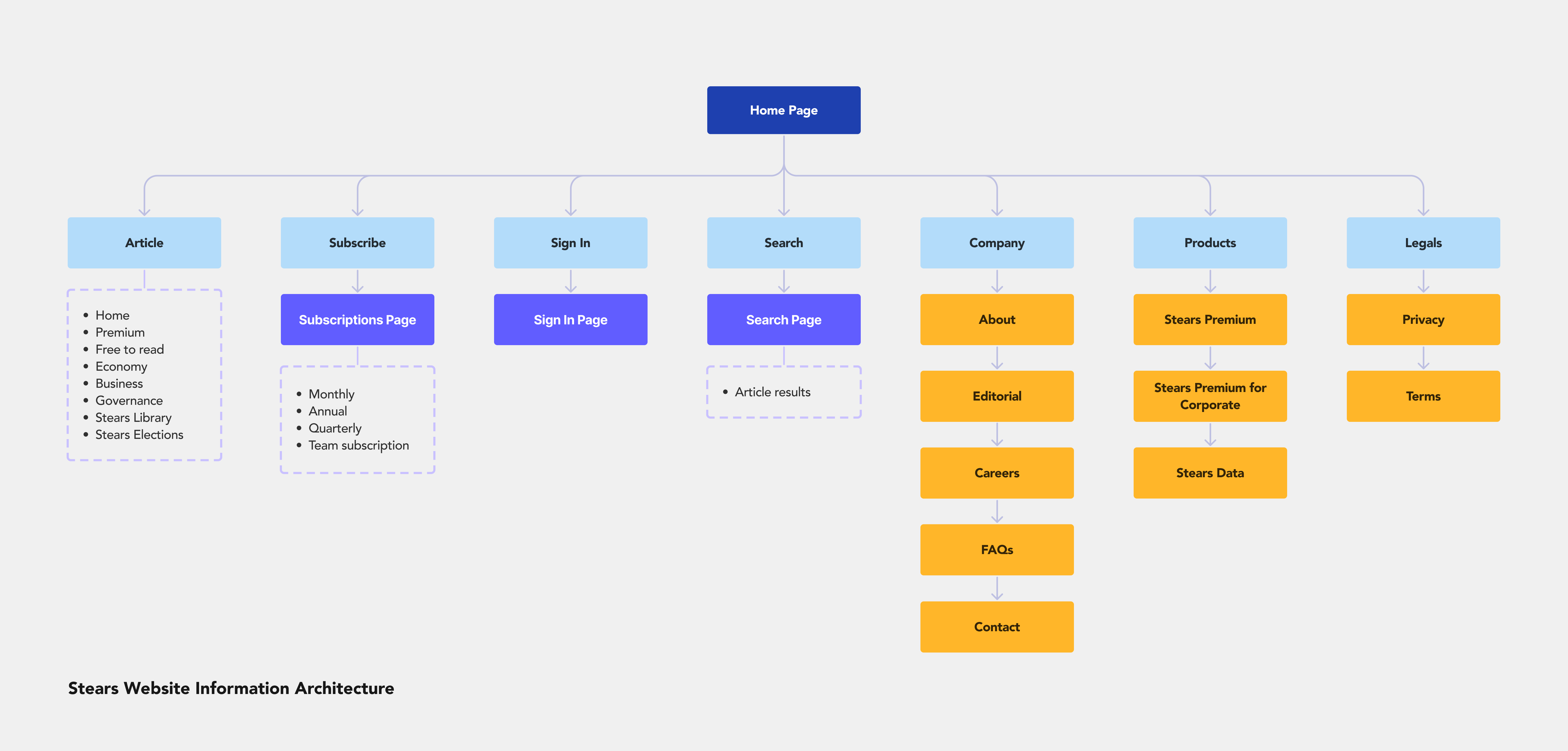
Flows and Information Architecture
The flows and information architecture for the mobile app takes from the current website. It was important to maintain this structure to match the mental model users are used to on the website. This way they would not need to relearn the entire experience.
Design and Prototypes
The tool of choice used for the design and prototyping of the mobile app is Figma. Clickup was used for project management and Teams for interviews.
The designs were in line with user flows that were created in collaboration with the product managers. Each feature designed for addresses a painpoint or user story.
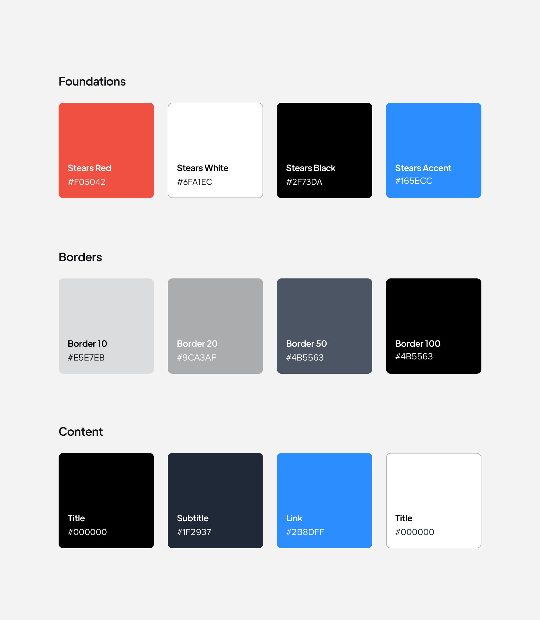
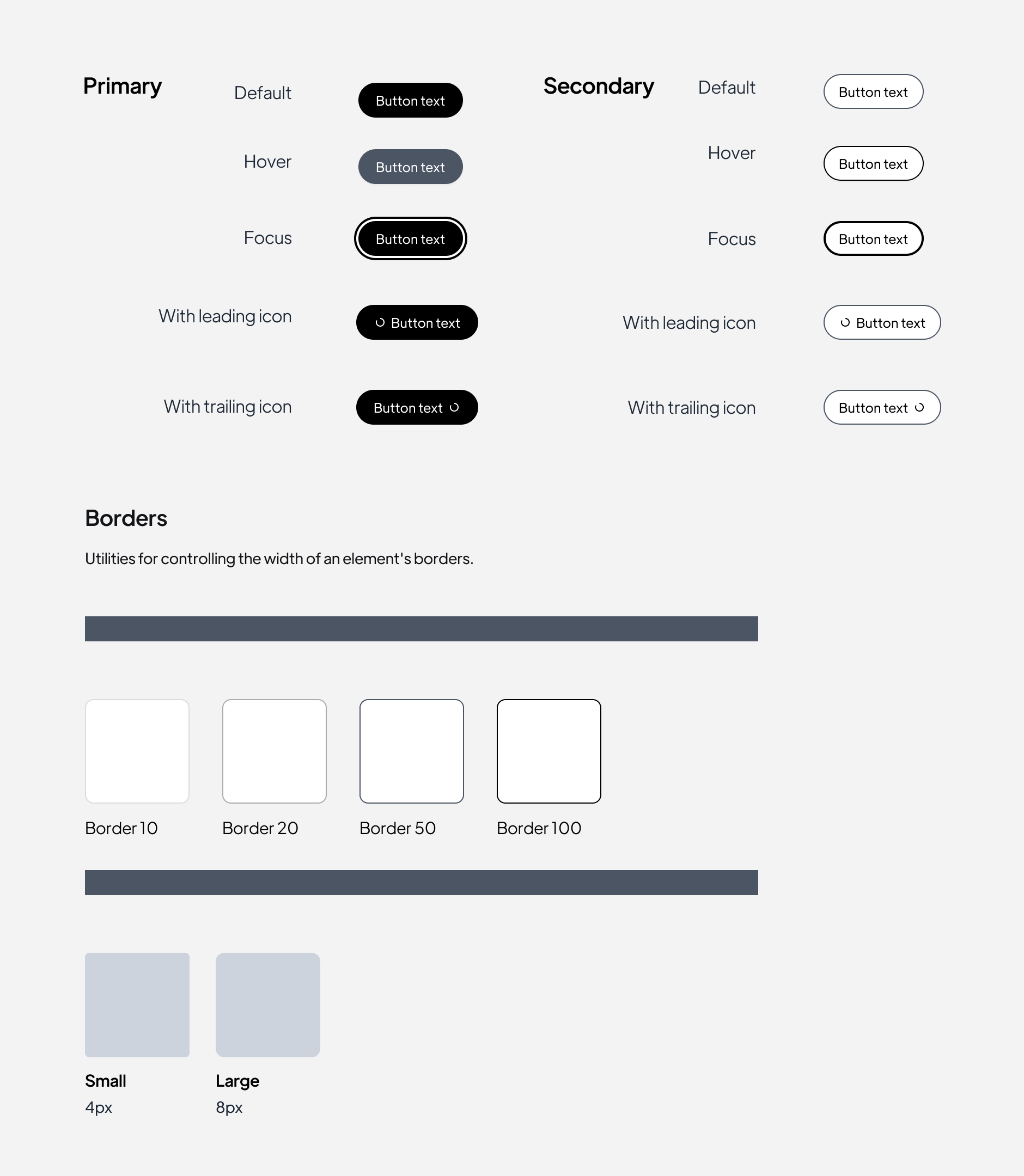
The design style utilized follows the framework defined by the design system. Wireframing was not implemented as there were already components to follow.
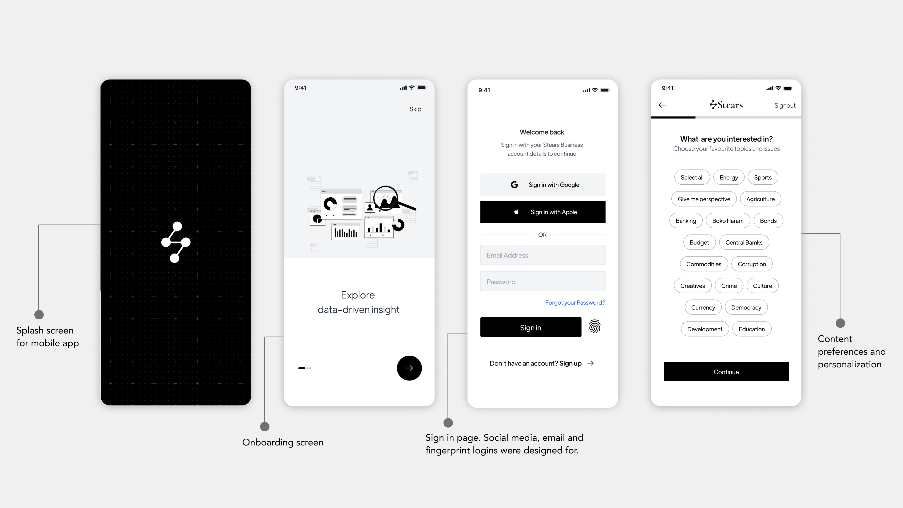
Indefinite Login and Personalization
The designs for the mobile app follows a flow that takes the user from onboarding to personalisation and then the homepage.
Solving the problem for users having to login frequently, the indefinite login approach ensures that they stay logged in. When they need to sign in again, they have the options of using their email, Google or Apple ID, as well as their fingerprint and password.
Content preferences and personalization allows them to select the type of content they want to see in the app. They can select their interests during onboarding, or make changes later in the app.
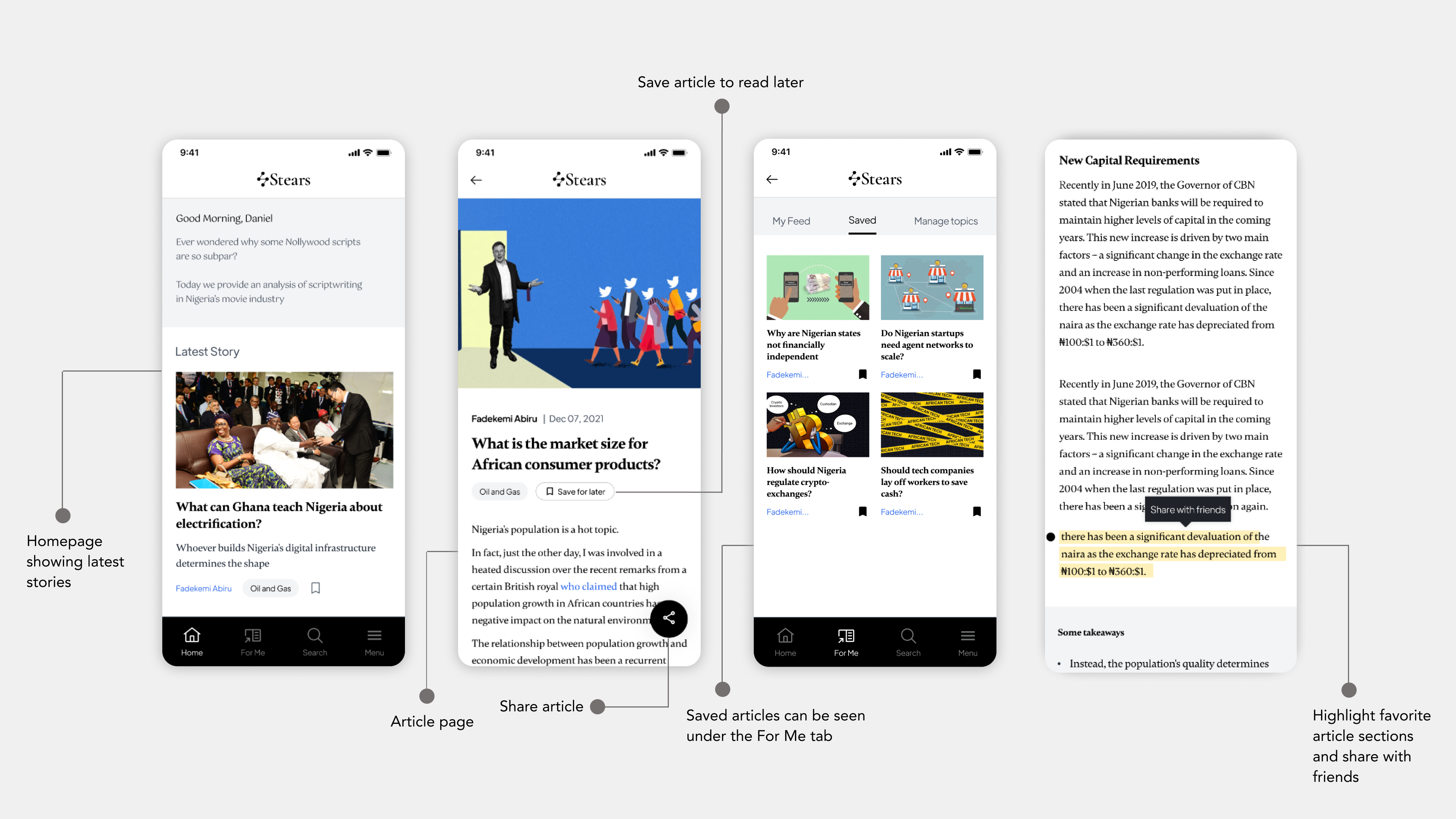
Content Discovery and Article Saving
From the homepage, the user can access latest articles that have been published. A recommendation section shows articles based on their selected preferences.
Within the article body, they can easily see the title of the article, the writer and date it was published. To solve for users wanting to read articles later, the save for later feature allows them to save an article which they can access under the saved tab. They can also share articles using the share functionality to social media.
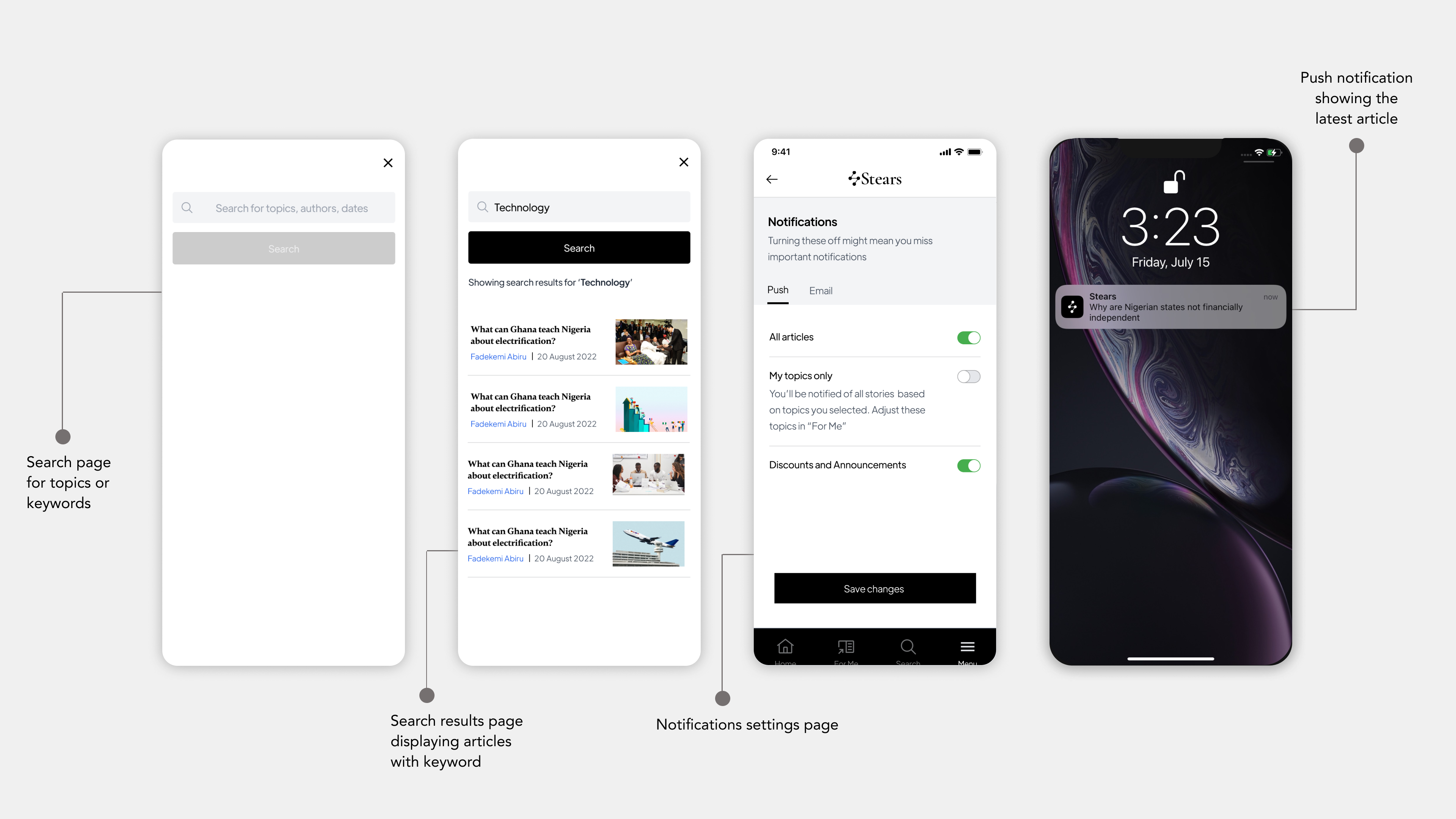
Search and Push Notifications
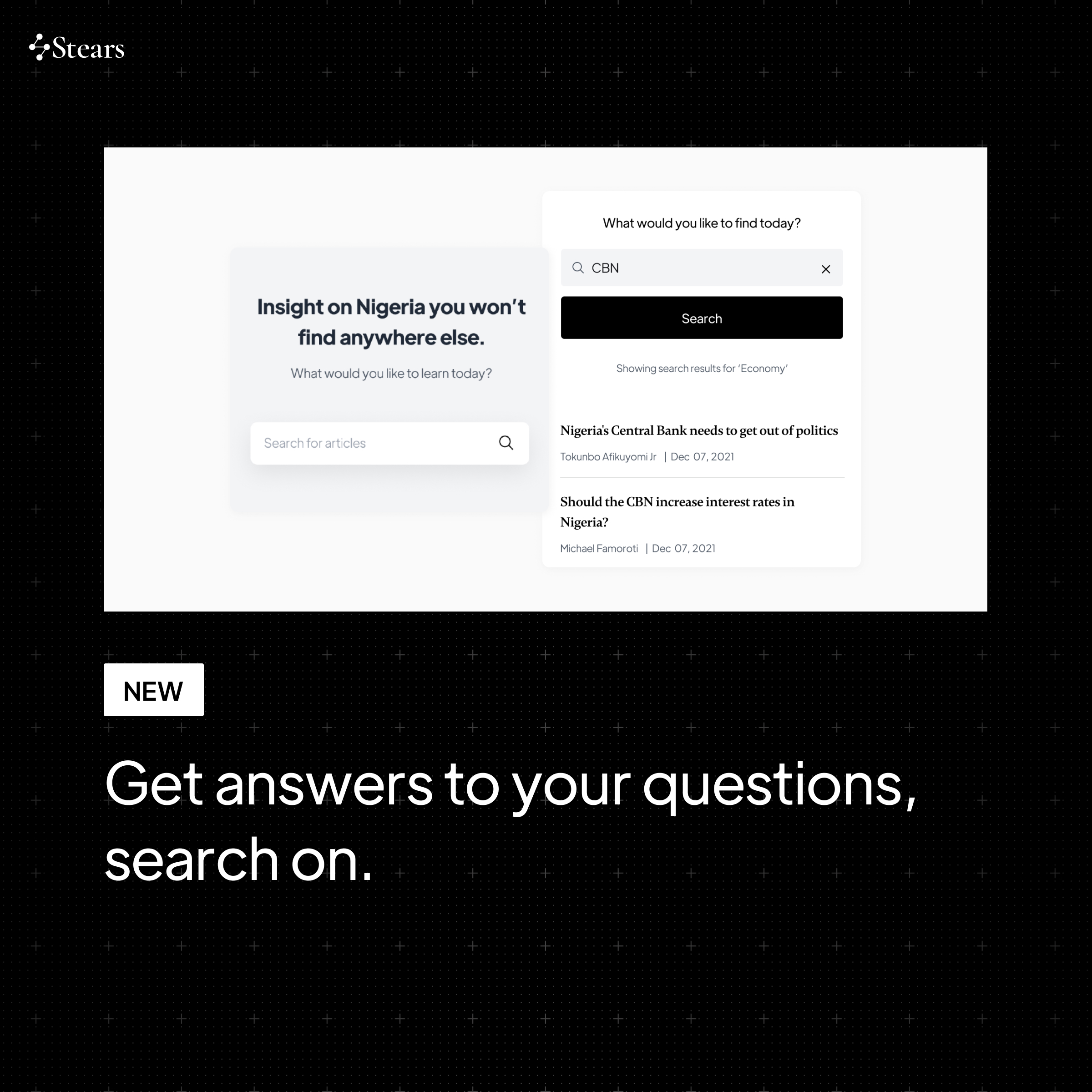
Being able to search for specific keywords makes it easy for users to access information they require quickly. The search functionality allows them to type in a key word and brings up related articles.
Push notifications solves for the problem of users not being aware of new article published. At 08:00 am daily, a push notification is sent out when a new article goes up. This approach minimises users missing new articles or email notifications getting lost in their mailbox.
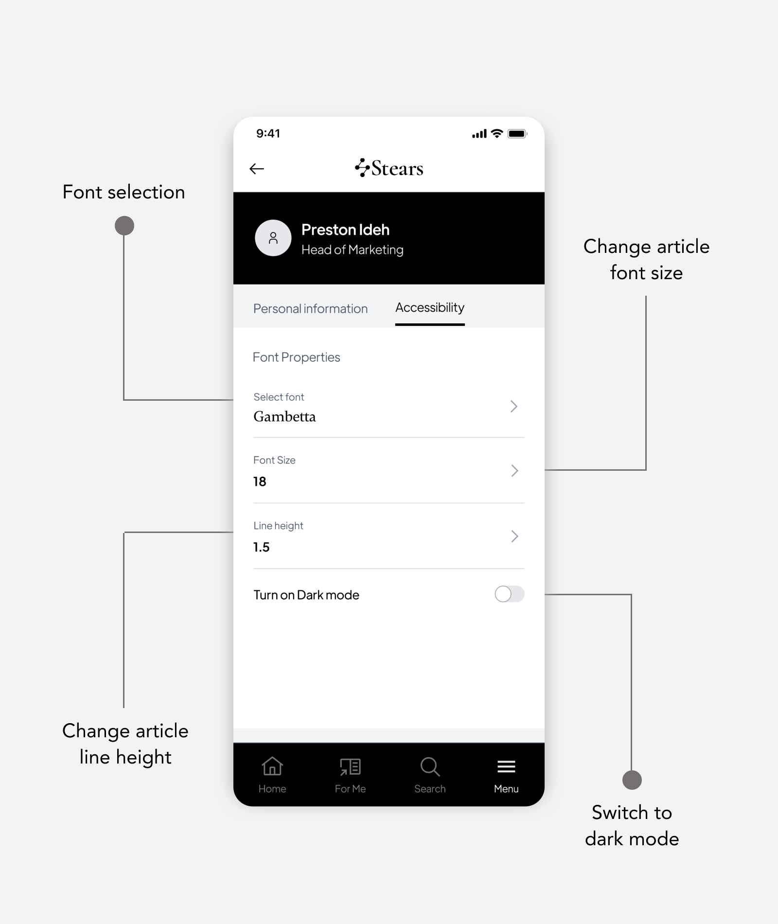
Design for Accessibility
Being a content and text centred application, designing for accessibility helps the Stears mobile app users to make changes to how the visuals of the application looks. They can change the font style, the font size and switch between light or dark mode.
User Testing
Usability testings that spanned over weeks were scheduled with 14 users that signed up to participate in the product test. The goal of the tests was to validate the designs as addressing the users needs and helping them achieve their goals.
The test strategies used were Click Test to check that the user makes a first click to carry out a task in an easy way, 5 Seconds Click Test to gauge user’s first impressions on pages within the designs and Task Execution to see if the users could carry out specific tasks on the prototypes successfully.
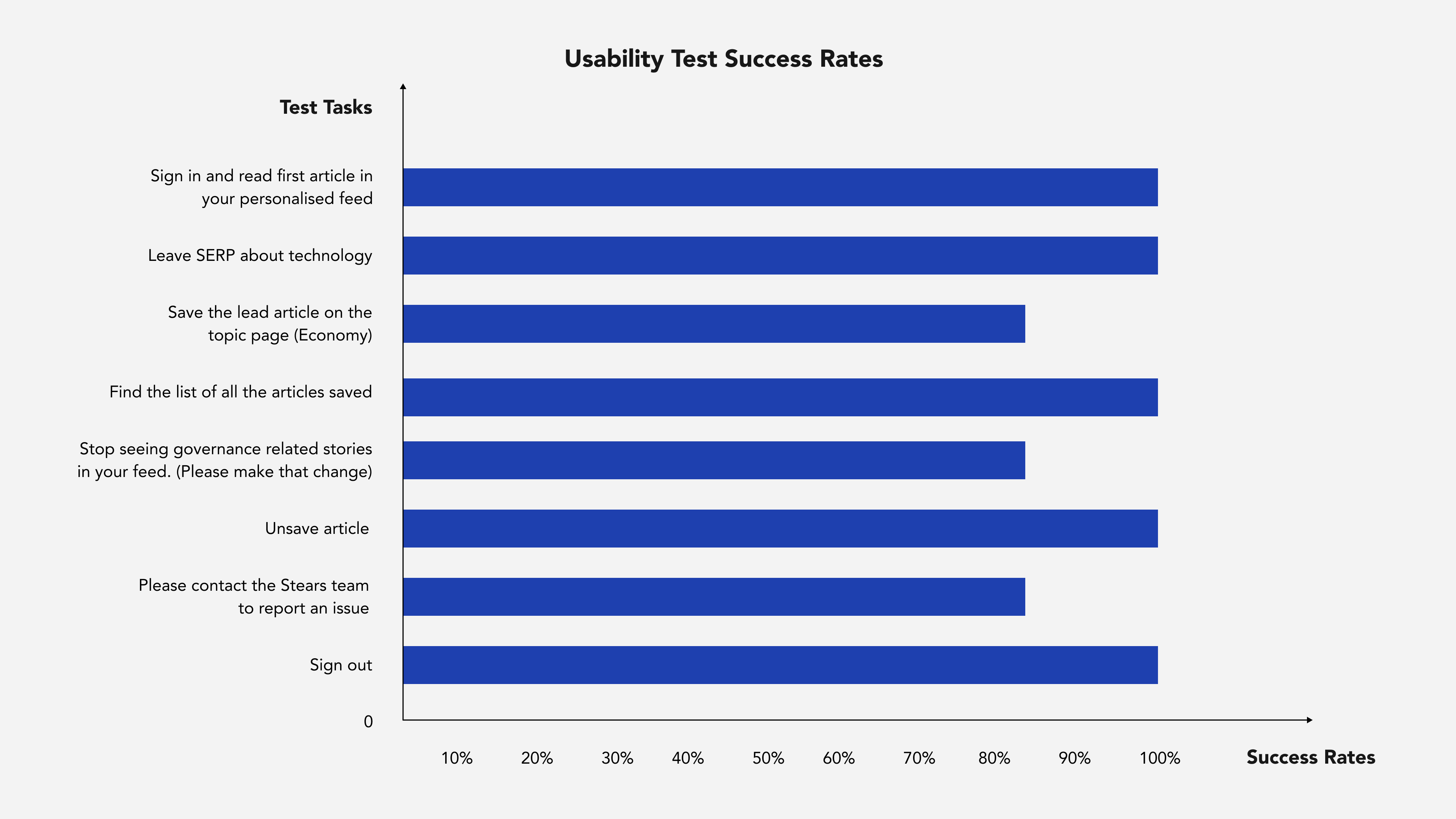
Testing Insights
Having the users test the designs provided further insights from which iterations were done. Test recommendations that were implemented include the following:
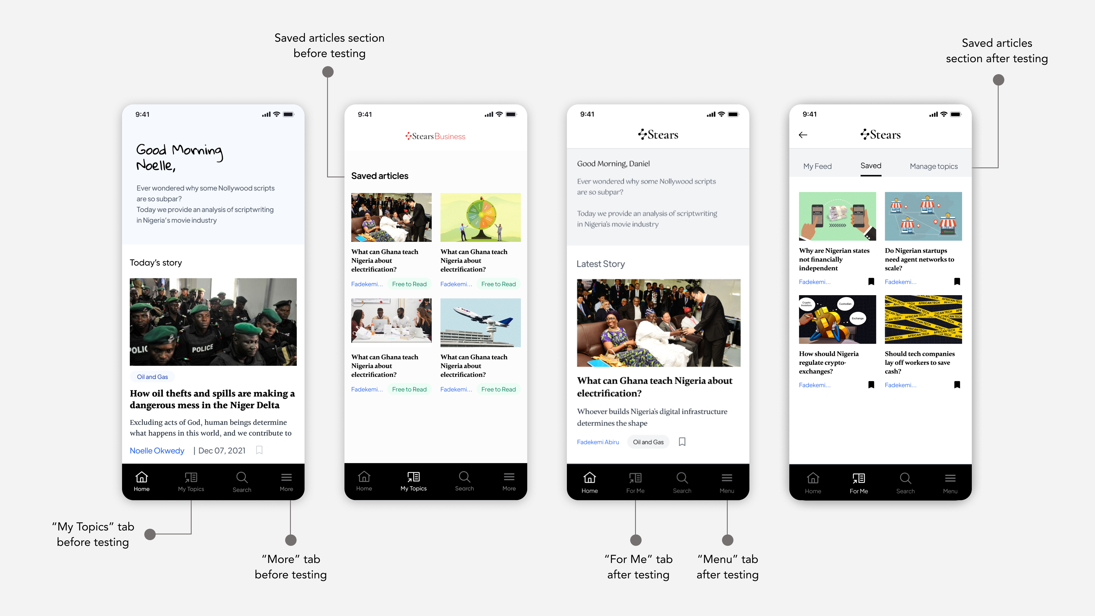
- Changing “More” to “Menu” and change “My Topics” to “For Me”.
- Making distinct topics under “My Topics” clickable.
- Move “Saved Articles” to somewhere more obvious.
- Remove saved button from “Manage Topics”.
Handover and App Launch
The mobile developer Abeeb, was fully involved in the design process. This way, development expectations were communicated properly. Following design changes from testing feedback, fully prototyped designs were created. A walkthrough of the updated designs happened with the developer, and the designs were handed off. Several app instances were developed and tested for both android and iOS. Issues such as text and image sizing, connectivity and signing in were identified and fixed.
The Stears app was launched on Apple Store and Google Play Store on July 27th, having fulfilled the necessary platform requirements for both app stores.
I collaborated with the growth team to make official announcement and product marketing happen. The creative visual direction for the app marketing focused on showcasing the new app features. Designs for the launch spanned across social media graphics, merch design and motion graphics.


Did Our Solution Work?
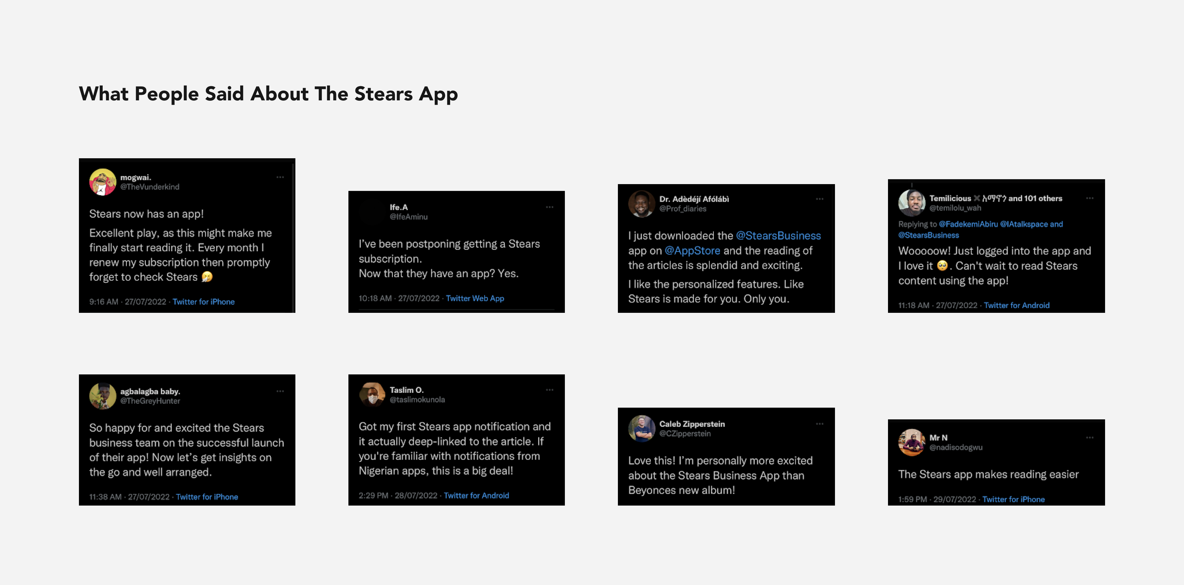
The Stears mobile app debuted at No. 2 on App Store's News category and No. 4 on Play Store's News and Magazine category. It had over a thousand installs.
Feedback was tracked from users following the mobile app launch and documented. The success metrics defined for the app launch was a functional product that resolves all identified pain points and is ready for users to download at the specified deadline.
That's a Wrap Folks. Lessons and Takeaways?
Quite a number of lessons were learned through the course of carrying out research, designing, testing and marketing the Stears mobile app. Personally, the importance of user-centered approach in designing and fostering the best collaboration was a major lesson for me.
Going forward, some post-launch action points include:
- A team retrospective session in which we recapped the mobile app project and talked about how to streamline designs for other products or features.
- Update of minor design fixes that were an oversight by development team, such as text sizes and the order of articles displayed on the homepage.
- Conducting a post-launch survey to validate success metrics, particularly Customer Satisfaction Score (CSATs) to identify level of satisfaction and 5-Star Score for app reviews and general satisfaction. The Stears app currently has a 4.8 Star review on App Store.
- Implementing identified improvements, iterating and making user experience better.